Start of News Personalisation @ SPH Media
In the news industry, personalisation differs significantly from industries like e-commerce or marketplaces. The ultimate goal in publishing is not to sell but to engage. We want our readers to consume more content which will lead to them spending more time on the platform.
I was part of an ambitious team that pioneered news personalisation on The Business Times, making it the first newsroom at SPH Media to embark on this journey. Our efforts laid the foundation for other publications.
To comply with my non-disclosure agreement, I have omitted and obfuscated confidential information in this case study. All information in this case study is my own and does not necessarily reflect the views of SPH Media.

Problem Statement
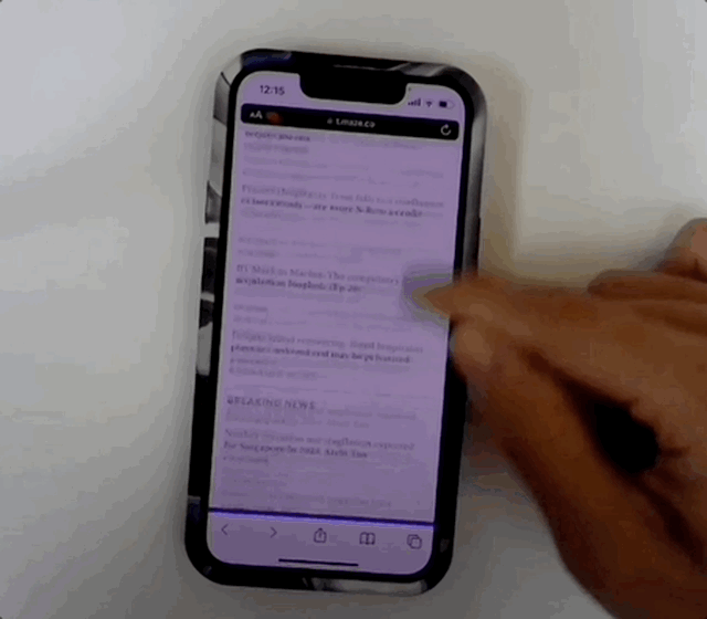
Currently, our readers are spending more time navigating the site and find themselves having to browse through topics that do not align with their interests.
2 out of 3 readers predominantly read from 1 section.
It takes an average of 4 clicks to get to their first article.
“I have to go through a lot of topics that are not in my interest before finding anything relevant.”
Hypothesis
By allowing readers to curate their newsfeeds with topics of interest, they are able to cut the noise and spend their time consuming content. This will increase the overall reader satisfaction and their engagement with the Business Times.
Our goal was to transform searching time into reading time.
Role
I led the framing, ideation and design work between October 2022 and December 2022 and collaborated with a senior designer on the Homepage, Article pages and Listing pages.
In addition, I worked alongside the Head of Product Design, UX Researcher, Content Designer, Product Editor and 2 Product Managers.
The feature was live on The Business Times’ website on March 4, 2023.
Getting the Context Right
On the onset of the project, we did not have a clear mission or set any goals on how we want to position this feature on the Business Times. After speaking to our stakeholders, we also realised this:
“Personalisation and Customisation are being used so interchangeably within the publishing industry that it’s just confusing for everyone and even our newsroom at this point.”
Taking a Step Back
Before getting into the design work, it was important to align the team and stakeholders on our own definition of Customisation and Personalisation on the Business Times and our strategy moving forward. Hence, I unpacked the concept of both terminology and presented briefly on various newsrooms and how they apply Customisation and Personalisation in their products.
Most importantly, I also demonstrated the correlation between Customisation and Personalisation. It is a matter of control: In personalisation, the system has full control and will tailor an experience for the user. Whereas in customisation, the user will have full control over the experience.

This Marks the Start of A Working North Star
Digging into the application of Customisation and Personalisation in the publishing industry revealed some helpful insights. This eventually convinced the team and our newsroom partners that Customisation can be the introductory step which could eventually reach the end goal of Personalisation. For a newsroom which is also going through digital transformation, this project also marked the beginning of News Personalisation in The Business Times.
With this, it marked the beginning of News Personalisation in The Business Times.
In addition, we also saw a business opportunity in this project which allowed the team to set bold ambitions and frame this as a motivation for the product team and newsrooms to collaborate and provide more premium experiences on The Business Times.
This also marked the start of a working North Star for us and the newsroom.

Now, introducing myBT
In an age where news is everywhere, myBT allows you to get only the news you care about by following topics of interest and curate your own newsfeed. You can now cut the noise and, spend more time consuming content which matters the most to you.

We've got your back
Based on session duration and page views, we put together a list of the top 20 keywords / topics which our readers are already heavily interested in, for example: Financial results, Inflation.
We make it easy for you to get started.

Complete control over your news
We know some of you will want to be more specific about the keywords like stocks thus we have also broken down top read BT categories Stocks and Regions into specific keywords. Otherwise, you can search within our database.
We give you complete control when it comes to choosing your topics of interest.

Now, sit back and enjoy
Now that you have followed some topics of interest, you have curated your personal newsfeed. Navigating the site tirelessly before reading anything relevant no longer exists with myBT.
Searching time is now transformed into reading time.

How We Got There
The designers came up with a series of questions which helped inform the design strategy and allowed us to make certain prioritisations.
What is the user breakdown by device category?
Are article pages the new ‘Homepage’?
How do we want our readers to be onboarded?
User Breakdown by Device Category
Over the last 3 months, 69% of readers visited Business Times on mobile. This then followed by desktop (29%) and tablet (2%). Given by how assessable news and information were on the go, this came as no surprise to us.

Article pages as the new ‘Homepage’ ?
In the publishing industry, there’s this uprising phenomenon about article pages replacing or being the new homepage as readers tend to go straight to article pages from social media or shared links. Over the last 3 months, we can see that 83% of readers did land on an article page first on BT.

Landing Page vs Onboarding
Getting the data for the device split and understanding the top landing pages definitely helped straighten out our design priorities. At this stage, several questions emerged hence we decided to kickstart our ideation process to understand how our direct and indirect competitors have onboarded users.
How do we present this feature to the majority of readers who will first land on an article page?
How do we also present this feature to the existing readers from other landing pages?

Article Page Onboarding

Homepage / Other Landing Pages
“Are we looking to grab attention or integrate? This will help guide the overall reader experience we are looking to achieve.”
Defining the Design Directions
Being curious and coming up with some prior concepts definitely jumpstarted our creativity. 3 key design directions emerged:
How might we present this feature to cater effectively to readers from any landing page?
How might we effectively convince our readers that this feature will significantly enhance their existing reading experience?
How might we design an onboarding experience that requires minimum effort from our readers?
How might we present this feature to cater effectively to readers from any landing page?
Getting the Priorities Right
Our data revealed that over the last 3 months:
Majority of readers (69% and above) visits Business Times on mobile.
83% of sessions begin with article pages as the landing page.
Out of all sessions starting with article pages as landing pages, 80.7% are initiated by readers on mobile.
Readers who start on the Homepage are more likely to be on desktop rather than mobile.
Based on these insights, I proposed a mobile-first design approach to cater to the majority of readers and that the design team should start with article page designs but also consider opportunities for other landing pages.
Starting with Article Pages
There was only one thing we knew for sure — Readers who go to an article page are primarily there to consume content. To a certain extent, we could also assume that they are somewhat interested in the topic.
Hence, our goal here was to raise new feature awareness but not disrupt the overall reading experience.

Early explorations of the article pages, focused on raising awareness without disrupting the reader experience
Stakeholder Sharing
Throughout the design process, we collaborated closely with Christopher the Product Editor, as he continued to provide helpful insights from the news desk. When we shared the early stage explorations, he gave some observations based on common reader patterns:
Attention spans are fleeting and readers will drop off if the writing no longer interests them.
Some keywords have extremely long names and it’s important to cater to these situations as well.
Based on the current taxonomy, some article can have more than 1 keyword or even up to 5 keywords.
Iterating after Understanding the Risks
The observations made by Chris certainly resonated with us and without much debate, we took the feedback in and went go back to our art board and put together some possible sources of inspiration.

Possible sources of inspirations, other publications which have similar concepts
With the feedback in mind, we made some integral design changes:
Considering that some articles could have more than 1 keyword, we agreed to display 1 main keyword upfront which should be the most representative.
The remaining keywords would be displayed at the end of the article. This would help reduce the readers’ cognitive load and allow them to fulfil their primary objective of content consumption.
For longer keywords, we agreed on truncation but at the same time, provide the reader an option to deep dive into the respective listing pages from the article.
When the reader first landed on the article page, subtle visual nudges could be provided to inform them of this new feature but it should not be disruptive to the overall reading experience.


Article Page Designs
Designing for Users who land on the Homepage
For article pages, scroll depth was the key design consideration due to readers’ varying attention spans.
On the other hand, the Homepage served as the landing page for only 9% of readers (desktop and mobile combined). Surprisingly, these readers spent an average session duration 132% longer than regular readers, viewing an average of 3.88 pages per session.
With these numbers in mind, we concluded that even though this reader group is smaller, they appear to be more open to discovering content.
This presents a promising opportunity for us to take a more exploratory and playful approach to our design.
The approach was to encourage the reader to explore the feature and understand what we have to offer. To achieve this, we collaborated with our Product Manager and Data Analyst to gather data on the top 50 clicked-on keywords by our readers.
Central to the concepts were these key design ideas:
Show the reader some of the most clicked-on keywords on Business Times.
Pique the reader’s curiosity by allowing them to explore and interact with the various keyword CTAs.

Early homepage concepts: being playful and discovering content
After presenting the concepts briefly to the product managers and design team, we received mostly positive feedback along with some helpful suggestions. This gave us the confidence to proceed with converting the concepts into high-fidelity designs.
“Discover page? The idea of creating a playground for them to discover content sounds interesting! What else can we do for them to spend more time explore this feature?”

Homepage designs
At this stage, we also handed over the user flows in order for the tech team to perform a primary assessment for the article pages and homepage.

User Flows
How might we effectively convince our readers that this feature will significantly enhance their existing reading experience?
Convincing Readers that it’s Worthwhile
Convincing the readers to onboard a new feature was an integral step of acquisition and this was where good storytelling and the right tone of voice played an essential role.
How your product speaks to your users is integral to their experience and has a noticeable impact: the right tone could be the difference between a one-time visitor and a convert.
We wanted the feature to embody the tone of The Business Times - Astute, Matter-of-fact and Punchy.
At this point, we did not have a Content Designer hence we got our Head of Product Design to help the team work on a content strategy which aligned with the newsroom’s strategy to BT Premium and helped us journey forward on the designs.

Content strategy
Showcasing the Best of Business Times
We decided to use more visual designs to communicate the concept of keywords for this feature and how our readers can customise their newsfeed with the content they care about. This also served as an opportunity for us to be creative and find ways to showcase the extensive amount of hidden content that was not easily discovered by our readers.
Central to our goal were these key design ideas:
Rely more on visuals to do the talking.
Text can be used but only when it’s absolutely necessary.

Designs concepts about keywords

Keyword design and branding
Bringing Ideas to Life
Finally, we designed the myBT page which allowed our readers to understand more about our latest offering and the ability to curate their own newsfeed with keywords. We introduced new visuals for the top 50 as an attempt to break the monotony. At the end of this page, we provided a FAQ section for readers who required further information.
This design aimed to reduce upfront decision‐making and carry a strong information scent to invite readers to use it.

myBT Page Designs
How might we design an onboarding experience that requires minimum effort from our readers
Easy Onboarding from Any Touchpoint
Finally for the last piece of the puzzle, we wanted to let readers to be onboarded seamlessly with minimal effort needed from their end. At the same time, news relevancy is key.
Again, we worked together with our Data Analyst to further breakdown top performing categories like Stocks and Regions into specific keywords and this allowed the us to accelerate our design work and at the same time, the team agreed that this would match with the mental model of the reader who would be looking for keyword recommendations during a typical onboarding process.
At the same time, it was important to consider power users who would like to have the control and flexibility of searching for niche or evergreen keywords.
This eventually inspired these design ideas:
Providing tangible recommendation to reduce unnecessary decision making.
Displaying timely and relevant topics.
Giving back the control to readers

Early explorations of the onboarding page
Challenges from Tech
The design concepts received positive responses from the newsrooms and product team, but there was pushback from the tech team regarding the proposal to display timely keywords to readers at any point in time. Unfortunately, developing this solution would require more time for investigation, which the team couldn't afford to wait for. As a result, the idea to display timely keywords had to be put on hold for now.
“Yes, we agreed that the idea of displaying timely keywords is relevant however, we currently do not have the infrastructure to support that. Probably, it will be ideal to do this for the next iteration.”
Next Iteration
After discussing with the tech team, we decided to postpone the idea of displaying timely keywords and instead, concentrate on maximising the opportunity to recommend evergreen and popular keywords to our readers.
Upon the completion of the onboarding process, the reader will be presented with his/her personal newsfeed with only topics of interests. To add more keywords, they can do it in the Settings Page, but that would be an extra step. So, we introduced a keyword widget to make it easier for them to add recommended keywords.


Onboarding Designs
Testing Our Designs
Once the team had a prototype ready for use, we knew we needed to put it in the hands of our readers. 3 weeks before launch, we doubled‐down on validating our wildest convictions. We conducted unmoderated/moderated user testing at our office and gathered the various insights:
All testers successfully setup myBT and read articles from myBT page.
Some testers were unsure that we were trying to promote keywords as there were no prominent visual differentation.
Several testers spent a lot more time on the Homepage because they were unsure how to proceed and didn't realise the need to scroll further to find the 'Discover myBT' button.
One of the sessions
The Refinement
Being able to see how actual users interact with our designs was a enlightening moment for the entire team. We were glad that our users were able to interact with the content and understand our new offering.
At the same time, it also proved that scroll depth should always be a key consideration when designing and initially, we assumed readers would just scroll down for further clarity which wasn’t the case.
To address the issues, we redesigned the Homepage's keyword widget. Now, the keyword UIs are immediately visible and distinct from the content. To add, readers no longer need to scroll down.

Design changes
The Launch: Start of News Personalisation
On March 4, 2023, myBT was launched on The Business Times—a shared achievement between Product, Design and Newsroom, considering that it was a new feature and rebuild from scratch.

The Impact: A Good Start and This is Still Day 1
It’s still early days for myBT, yet we have seen promising results. As at April 2023 (1 month into launch), at least 4000 readers have gone through the onboarding process and followed at least 1 keyword.