Staying Up-to-date with News
As of 2023, the abundance of news sources has raised expectations for newsrooms in order to impress. Offering the latest news has become a fundamental standard for many publications and for most readers, it has become their routine to stay up-to-date.
This project was part of our ongoing Quick-wins initiative to improve the reading experience on The Business Times incrementally through swift and practical design improvements.
To comply with my non-disclosure agreement, I have omitted confidential information in this case study. All information in this case study is my own and does not necessarily reflect the views of SPH Media.

Project Background
Importance of Breaking News Page
Breaking News is the 3rd most visited page on BT website with an average session time of 5 minutes.
What This Tells Us
Readers recognise the importance of staying informed and are willing to invest the time for it.
Reader spend a much longer time on the Breaking News page than other pages. (i.e. average session duration for entire BT site in May was 2m 38s)

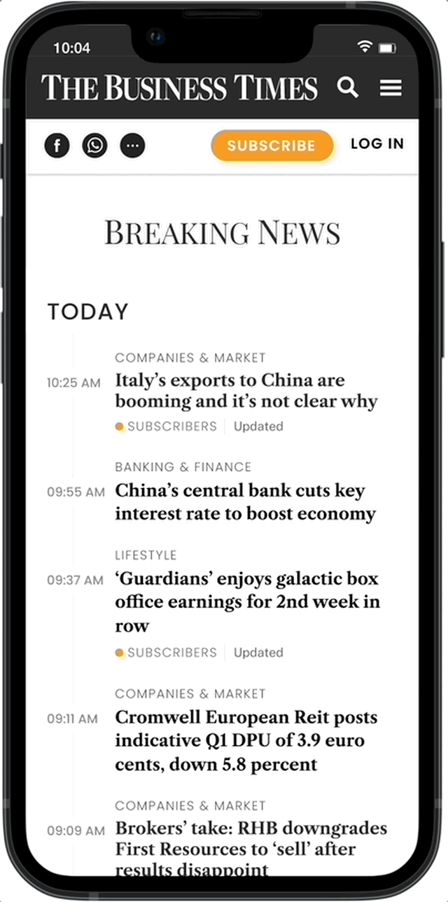
Current Breaking News Page Design
My Role
I was responsible for the experience strategy and design of the Breaking News page across Desktop and Mobile Web between April 2023 and May 2023 and worked alongside a senior designer. I led the UX Work, producing all major deliverables and presenting the design rationales to the Newsroom and cross-functional stakeholders.
The feature was live on The Business Times’ website on July 28, 2023.
Deciphering User Insights from Heatmaps
Scroll Map
25% of readers would drop off after the second fold and only 20% of readers would scroll to the end of the page.
What This Tells Us
If readers do not scroll down enough, they are likely to miss out on the latest news, given that the articles are currently sorted by category.

Scroll map: Breaking News Page
Click Map
Majority of the clicks are registered on individual articles.
What This Tells Us
Instead of delving into a specific category, readers appear to be more interested in reading individual articles from the Breaking News page

Click map: Breaking News Page
Problem Statement
The current structure of Breaking News is arranged by category first. Based on the user insights above, this structure does not align with our users’ reading behaviour.
It makes it difficult for them to stay updated with the latest news.
They are likely to miss out on the latest stories if they do not scroll down far enough.
Hypothesis
By re-arranging the news articles in a chronological order, we can help our readers fulfil their main goal of staying informed on the Breaking News page and avoid miss out on the latest news.
Now, introducing the new Breaking News Page
Your go-to place where you receive the latest updates on current events, the new Breaking News page provides a simpler and more intuitive way for you to remain informed on what’s happening around the world.
We give back your time
With a streamlined timeline design, you will know quickly of the latest news in a chronological order. BT saves you time without you having to scroll too much.
Customise your news page
With the filter option, you can declutter your page and focus solely on topics that pique your interest. BT empowers you with complete control to select the subjects that matter most to you.

You’re all caught up
Towards the bottom of the page, we see an opportunity to enhance the reading habits of our current readership through a positive feedback mechanism and a space for us to shed light on other BT content.

How We Got There
Our goal for the project was to allow our readers to stay informed with the latest news. The original premise was simple: Just re-arrange the news in a chronological order. However, we weren’t trying to hit a bare minimum and we understood clearly that in order to better serve our readers’ needs, we needed to design more meaningfully and intuitively based on how readers currently consume news from Breaking News.
Three key design directions emerged:
How might we create a simple and intuitive way for our readers to stay up to date?
How might we allow our readers to customise their reading experience?
How might we reward our readers for staying informed with BT?
How might we create a simple and intuitive way for our readers to stay up to date?
A major reason that prevented readers from staying current was because news articles in the Breaking News were arranged by category first, time second. This approach causes the reader to potentially overlooking the most recent news updates if they do not scroll down further.
Our data revealed that over the last 3 months:
66% of readers assessed the Breaking News page via mobile.
Majority of the clicks were registered on individual articles instead of the category title.
25% of readers would already drop off after the second fold.
Based on these insights, I proposed a mobile-first design approach to cater to the majority of readers and focused on the design concept of Familiarity in order for the final designs to be more likely to be easily understood and intuitive, leading to increased engagement, satisfaction, and loyalty.
Familiarity in UX Design
Familiarity is closely tied to cognitive processes such as attention and memory and this can be influenced by the design elements and patterns used in an interface which in turn, motivated me to investigate prevalent tools that make use of features like timestamps and concise content.

Possible sources of inspirations

Early stage explorations and wireframes
Without much debate, the team was aligned that being able to scroll through the news articles arranged in a timely order matched the mental model of a reader who wants to stay up-to-date on the Breaking News page. In addition, having the category near the article title proved to have substantial contextual value for the reader.
To avoid overwhelming the reader with a multitude of news articles, we designed a fixed date stamp positioned at the top, which will be visible as the reader navigates the page.


Final Designs
How might we allow our readers to customise their reading experience?
The inspiration behind this HMW went back to one of the key findings from our most recent BT User Discovery.
Our users want a curated presentation of content that meets their interest areas.
The Business Times is a specialised news publication, with a focus on regional business news for the community. Our readers are aware of that and as such, approach BT as a resource to give them specialised information. As such, finding relevant information fast and having the right information presented to them becomes a priority.
Central to these findings were these design ideas:
Giving back control to our readers to only view topics relevant to them.
Presenting those topics promptly.

Early stage explorations and wireframes
Displaying categories upfront vs Filters
Giving back control to readers to curate their own Breaking News page eventually inspired two design idea with their sets of pros and cons.
Displaying categories upfront would be effective in capturing attention and encouraging readers to promptly choose a topic of interest. However, due to the potential random arrangement of category names, readers might find themselves needing to scroll further down, introducing friction.
Using filters addresses the challenge of lengthy category names, yet it demands additional effort from readers, involving an extra tap that could be easily overlooked.
After several rounds of discussion and poor internal testing results, I killed the idea of displaying the categories upfront in favour of using the filters and focused on improving the visual prominence and placement.

Final Designs
How might we reward our readers for staying informed with BT?
For the last piece of the puzzle, we wanted to infuse some delight into the overall reading experience. Most importantly, we would like to introduce the concept of positive feedback mechanism to reward our readers for staying current and generate motivation for them to strengthen reading habits.
A key design challenge was to consider how design and animations can contribute to telling users that they have done well without it disrupting the reader flow.

Moodboard
The newsrooms and product team really liked the design ideas and reasons behind them. This encouraged me to take even braver steps in my design choices. These choices involved adding clever animations and collaborating with Content Design. We highlighted more well-performing BT-related content, as a way to further interest our readers and get them to spend extra time with us.
The goal was to increase user engagement via a habit-forming UX while showcasing other aspects of BT.


Final Designs
The Impact: Promising Results So Far
The redesign of the Breaking News page has had a positive impact on the overall reader experiences as readers reciprocated the ability to curate their page with topics of interest (1 month into launch), as feedback by the newsroom. Given that this is a relatively newly-launched design revamp, I believe we will be able to collect more user feedback overtime and continuously iterate.